You can access the
Chart area of the website by pressing the  button at the top of the page. When you first
enter the Charts area you will be presented with the following screen: button at the top of the page. When you first
enter the Charts area you will be presented with the following screen:
|

|
(NB. The MoneyAM website has
the ability to remember if you were looking at a specific stock as you
navigate your way through the pages. So for example if you have been
viewing BARC on the Trades or Quotes page when you enter the Charts page
BARC will automatically be displayed)
As you will note there are a number
of drop down boxes with which you can choose to customise the chart you
wish to view for any specific stock you have chosen. These are as
follows:
|
| Epic |
Use
this field to enter the Epic of the stock that you wish to view e.g.
VOD |
| Period |
This
screen denotes the period of time you wish to be displayed on the chart.
you can choose to set specific date or you can choose pre defined
parameters such as Intraday, 1 Month, 1 Year right up to full historical
data (All Data). |
| Scheme |
Choose the scheme in which you want to draw your chart >from the
following; standard, designer, colourful and mono. |
| Plot |
Choose the type of chart you wish to see. Choices are Line, Bar
and Candle. |
| From |
Enter
a date here from which you want the data to begin. This is a customizable
date range. |
| To |
Enter
a date here from which you want the data to end. This is a customizable
date range. |
| Grid |
This
function allows you to add or remove grid lines from the chart. You can
choose from full, main or none, depending on your preference. |
| Size |
Choose how big or small you want you chart to be. |
| Draw
Graph |
Press
the Go button to generate your customised chart. |
|
Types of Chart:
|
Line Chart
|

|
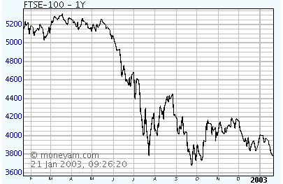
This an easy chart to follow
and is very popular amongst investors. The line is plotted between the mid
prices on each day in the date range selected.
|
Bar Chart
|

|
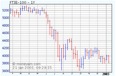
A bar chart gives a greater
amount of information than the line chart. The vertical lines follow the
high and low price range for that day.
The horizontal lines mark that days
open and close price. A left tick (horizontal line) represents the days
opening price, a right tick represents the days closing price. The
top of the bar (the Wick) represents the mid price high for the day and the
bottom of the bar represents the mid price low for the day.
|
Candle
|

|
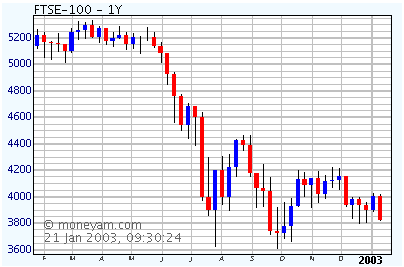
This is a very similar graph
to the bar chart in terms of the information supplied. The
shading/colouring on each Wick denotes the direction of the stock between
open and close, for example the top of the band on a red candle would be
the price at which it opened and the bottom of the red section would be the
price at which it closed. Conversely the top of the band on a blue candle
would be the price it closed at and the bottom of the blue section would be
the price at which it open.
|
Intraday Charts
|
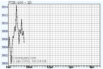
Intraday Charts display a
stocks price in real time during the day.
Intraday charts are created by
using the drop down box at the top of the charts page by clicking on the
�Period � drop down box and selecting �Intraday �. These charts can also
be customised in the normal manner as described previously.
|

|
Investors can find these
types of chart a crucial tool in the timing of transactions.
Share prices can fluctuate
considerably within a day, having major peaks and troughs in a similar way
to those shown on both weekly and monthly charts.
These charts act as a great way to
follow a specific shares movement throughout the day. Below is an Intraday
chart showing the peaks and troughs from Market Open to 10.30am. The charts
plot as time passes throughout the day.
|

|
| As you can see VOD has opened
at 124.5p dropped initially, moved upwards and then fallen again to
125p. |


